
Kingdom Death: Monster is a horror themed boardgame that is rather unique – it seems to play like a cross between the post-game dice rolling of Necromunda and boss fights from World of Warcraft, two of my favourite things. I haven’t played it much yet but the sheer quantity of cards and things to fill in and roll up is overwhelming, I haven’t seen anything else like it.
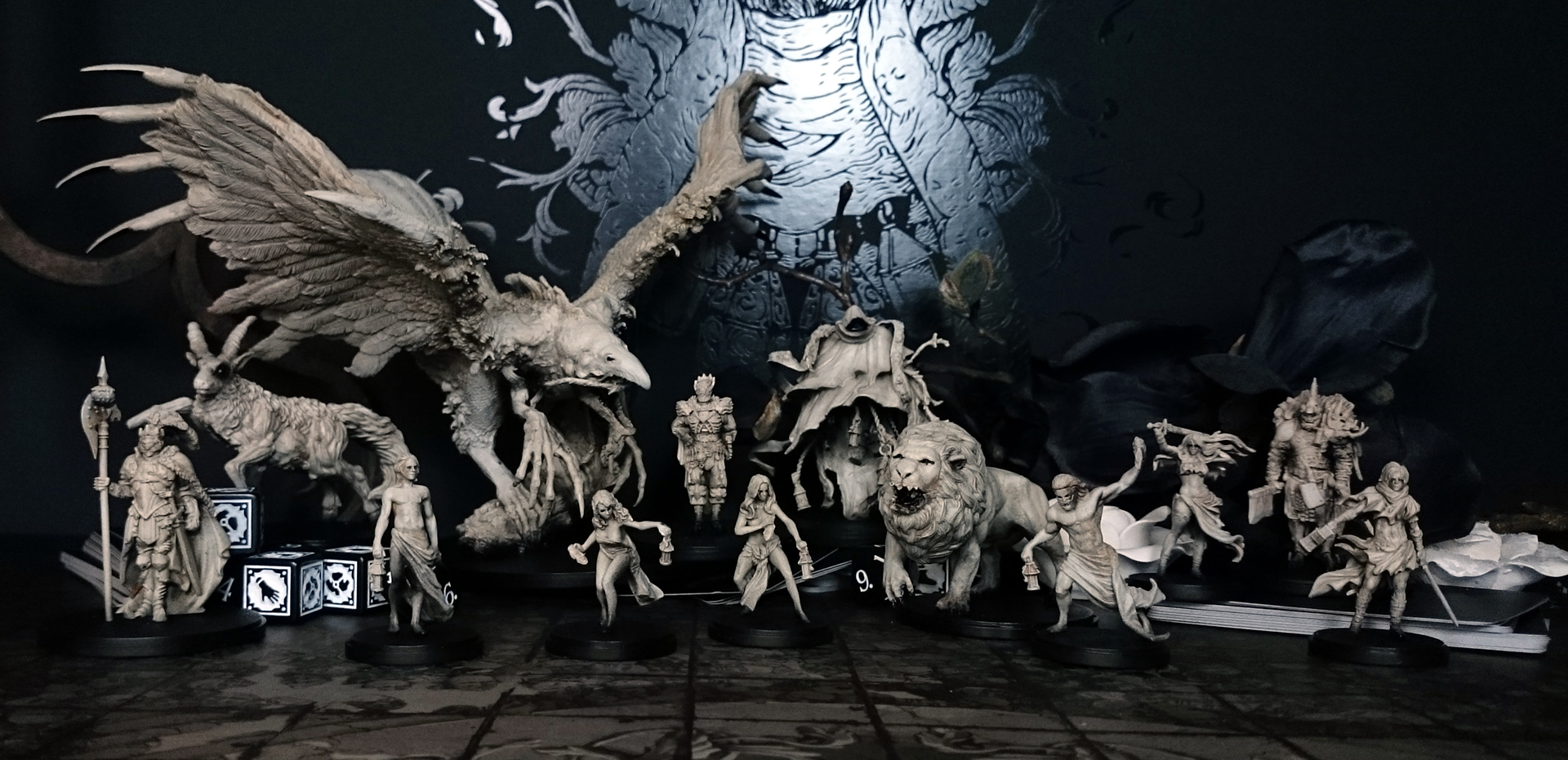
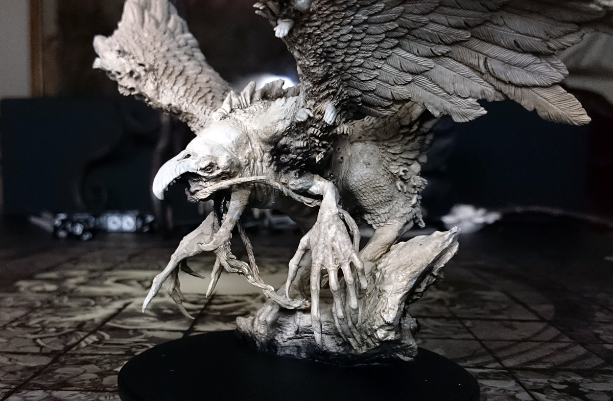
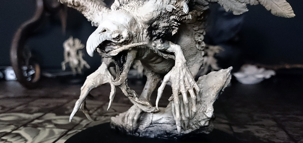
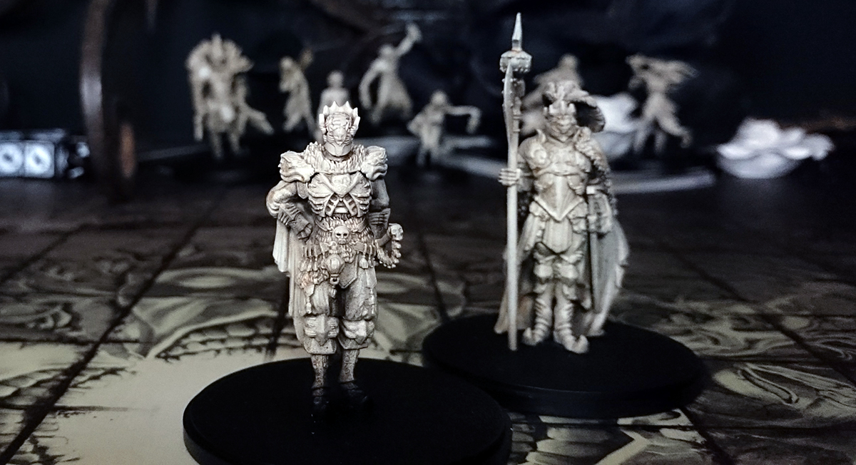
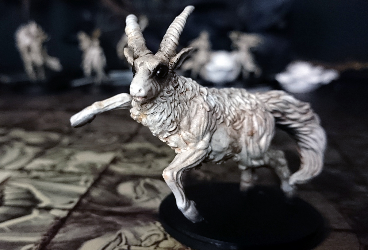
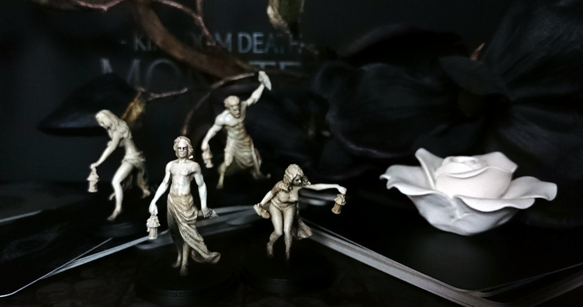
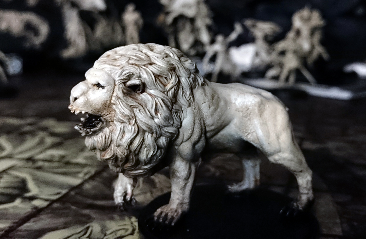
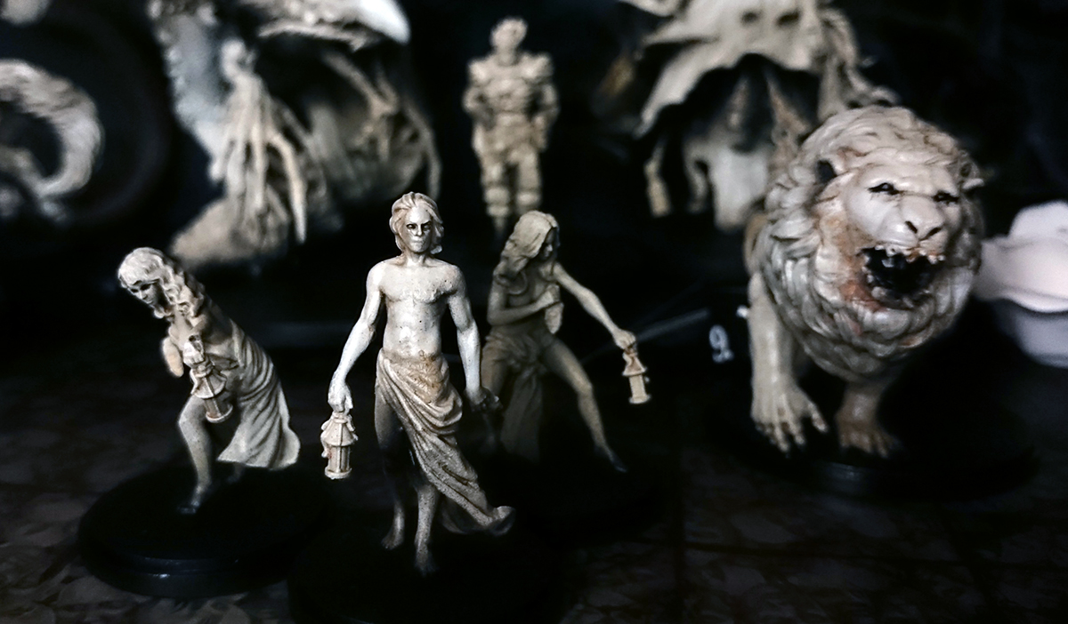
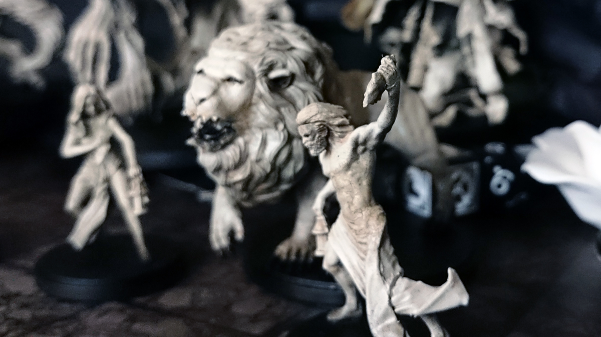
I felt that the miniatures would look best in monochrome, even the best paint jobs I have seen have looked too colourful. I wanted to make the figures look like an expensive gothic chess set, maybe as if they had been carved from narwhal horns or jackalope skulls. I like most of the miniatures that come with the game, but to my mind the four starter survivors, the lion and the phoenix are the standouts, really quite beautiful. The multipart survivor models (which I have not assembled) are not very good, and would require a lot of converting to make them fit in with the standard of the other figure. I think I am happy to use the starter survivor figures to represent all survivors, rather than attempt to accurately model new survivors.
I think the details of the sculpts are quite soft, particularly on the survivors, perhaps they would look better in resin – I am not particularly keen on plastic these days. I used liquid greenstuff and crackle paint to increase the detail and texture on the models. Initially I wanted to try and make them look as if they were a sort of bone or quartz, but the white I used was too opaque and a lot of the previous layers were covered up (I used a lot of metallics to try and emulate the slight sparkle in quartz, and a lot of dark splatter to represent the flaws and shadows found in bone). I’ll figure out how to do this one day, I think I need some better translucent white. Instead I ended up with something similar to my Stormcast, a sort of porcelain effect, which is OK.
The black and white scheme also reminds me of the manga artwork of Berserk, this is probably the main thing that drew me to Kingdom Death: Monster as, like Dark Souls, it is very much influenced by Berserk. Lots of great details like the teeth on the lion or the exposed brain on the Hand are lifted from the Berserk manga.
I was ultimately persuaded to give Kingdom Death: Monster a go by the guys at Between the Bolter and Me who have done some great posts about the game, but who also pointed out to me that the pinup range of Kingdom Death are not part of the Monster game, the main thing that was putting me off. I find the pinup range largely an embarrassment, and though I can understand why Poots (the guy who invented Kingdom Death) has continued making pinups – they seem to sellout immediately for insane prices, and I suspect the revenue they made has largely enabled him to produce Monster – I wish he would stop. They are exploitative and the association with Monster makes it feel sleazy. This sort of thing does the noble hobby of wargaming no favours with perception by the wider world.
Thanks for the shout out! I am impressed how quickly you were able to assemble and paint everything! I really like your scheme, and agree that virtually all of the paint schemes I have seen are too colorful and detract from the hopeless Berserk feel. I also second your thought that the initial survivors are probably the best models in the box. The multipart ones are pretty bad, oddly proportioned, and not really created to the same level of quality as the rest. They would require a lot of work carefully selecting the few good pieces, and converting much of the rest to fit with the other models.
Your assessment of the detail being soft on a lot of the models is spot on too, and can confirm that some of the models look noticeable better in resin. Although this is not the case for all of the models; I almost feel Poots spent more money getting better molds for select models (the pin-up is a lot of cases…). Most of the plastic models don’t fit together very well either, requiring significant green stuff work to make them look finished (lion and antelope for example).
Good luck starting to play the game! Just be ready to put up with a lot of needless randomization, that cannot easily be manipulated. The game has a lot of good ideas, but at times it can feel as though a little more critical play-testing could have substantially improved the game. If possible, I would suggest playing with a few people. Although it can easily be played solo, when people start dying due to poor rolls, it is better to laugh it off with others.
One advantage of this paint scheme was that it was quite fast to paint, I really wanted to get playing with painted models but I was never going to paint them all if it took too long. Assembly wasn’t too hard, I mostly struggled with the Watcher, and a lot of greenstuff was needed for the lion who still has a bit of a crack along the top of his mane.
I like the randomisation so far, it helps create unique events. Some steps have seemed needlessly fussy or excessive in the number of rolls or actions required (for example, some of the initial settlement setup), but I suppose they will make sense later when more options are available.
I really like the style of the game (apart from the odd anime girl illustration) and some details – such as the way that if the lion tries to bite off your head, but it doesn’t have a jaw, it just vomits blood all over itself and everyone watching goes a bit more insane. This is my girlfriend’s first real boardgame, hell of an introduction!
Can’t comment on the gaming side of this, but i luv what you have done with these models!
Great paint job, very atmospheric, fits these minis perfectly. The survivors almost look ghost like.
Very inspiring, cheers Jake.
Thanks man, definitely trying to go for atmosphere here. Ideally we’d play by candlelight on a stormy night, except with so much paper around it might be a fire hazard. I really love painting white and glossy black, the contrast looks great in real life but loses some of its impact in photos.
I meant to ask if those hands are separate on that large monster, they would work a treat with a mourngul conversion! Lol
They are, and they would. There are lots of great bits, I’d love to cut up a lot of these models for conversions but they are pretty expensive. There might be some spare pheonixes around though, I think they were given away as a kickstarter incentive. Personally I want the Forge God.
Thanks Jake! I’ll look out for those!
Great idea for a color scheme. The King’s Head and King’s Hand figures (I think that’s what they’re called?) look like they’re done like some of the more elaborate carved-scrimshaw I’ve seen. I wonder if they might benefit from a little yellowing to heighten the aged bone look? Either way, this is the way to do these figures. Bravo.
I did start from a yellow undercoat, but a lot of the depth was covered over by a much more opaque white than I had wanted. I started with yellow and green, then black splodges and metallics… Then all that got covered really. Still refining my technique.
Seeing these lovely white monochromes makes me wonder how to achieve a complementary black for the other half of a gothic chess set.
I did consider doing the heroes and monsters in opposite colours. Black would be tricky I think because you can’t really shade or highlight and a plain gloss black might be quite nice but it would lack impact. My plan was to paint them in a very dark metal, but in the end I decided all bone would look better.
Thanks for the comment
Hey man, really nice effective and evocative paint jobs. I must agree that the majority of painted models that I have seen for Monster seem way too vibrant and colorful for such a grim and completely hopeless setting. And as I have just said, I think that your scheme is definitely evocative to the setting and does it justice. For me, I think this best comes across on your four survivors, I can’t really say why though…haha. Just a gut feeling. I may have to steal some of your techniques for my own models, as i have been humming and awwing about how best to paint them that feels true to the world… And seeing your miniatures has definitely helped me to come up with rough ideas of what I want of them. I shall have to look into Berserk to try and channel some more inspiration as well. But for now I am thinking of using very pale and washed out colors for the main body of the miniatures with a few instances of deep full color, such as blood or obsidian like weapons to draw the eye… We shall see how it goes and if my level of painting is even up for the challenge.
The art in the game, that isn’t of the anime boob kind, is quite stunning and I enjoy the various art styles and directions that these take. And I personally think they are some of the best art for either wargames or boardgames that I have come across, and it does wonders to create the bleak and utterly hopeless universe of the game. Though as for the models, I have to second you completely, regarding the pinup models… I am ok with a lot of the official Monster models that show off a bit of boob or ass, such as the 2nd Lion Knight model or the Forge God, as they, to a lesser extent, help to cement the lowly positions that humanity inhabits in this world, and they kinda fit with the mature air that the game is supposed to have, and they have comparatively more taste than their pinup sisters. Though could these same elements have been achieved without the scantily clad models, or by applying a little more clad? Of course they could have… But the Pinup models are just embarrassing. I mean each to their own, but as you say; “They are exploitative and the association with Monster makes it feel sleazy. This sort of thing does the noble hobby of wargaming no favours with perception by the wider world”, and I completely agree.
Haha, anyway, enough of that. Good job on the paint scheme and as always I look forward to seeing more of your work.
Thanks for the comment. I think that the models that ‘help to cement the lowly positions that humanity inhabits in this world’ are great, I really like the Forge God, the overt sexual themes of the model and similar ones is OK by me. The problem is when other models in the same range go for titillation – you can’t have both because then you are creating an association – real or imagined – between the sexy pinups and sexually violent monsters, which is frankly, tacky and immature.
Good luck painting your set. I knew I wouldn’t want to play until I had them all painted, so it was important to find something I could do quickly, as I have a lot of other models I would rather be painting. Sometimes we have to be realistic in our goals with these things.
Great classical painting Jake, they put me in mind of greek statues that have lost the garish colour schemes of the classical age , I have always liked the idea of showcasing the sculpture of miniatures by toning down the adornments.. i think you have taken this idea to its logical extreme.. although i might personally be tempted to stick them on top of plinths and columns and turn them into scenery.
I haven’t quite got the hang of replicating a material/texture yet, so I am happy that they are evocative of statues even if they aren’t exactly what I was after. I originally wanted to make them look like they were carved from bone, at 1:1 scale, but it is surprisingly tricky! I have got a bit closer since with this https://twitter.com/Ex_Profundis/status/679736518257303555
And yeah, this technique may well end up being used for 28mm scenery.
Awesome stuff! I’ve had my eye on this set for some time as the visual aesthetic of the main box set really appeal to me. You’ve done a wonderful job in painting them and it’s made me want to go out and buy my own set. It’s a shame about the huge price tag. Even if the miniatures and components are beautiful.
The price tag is pretty nuts, I thought I could get some money back by selling the armour kits sprues but they are now sold on the website at a reasonable price, so that scuppered that plan. I think some used copies of the game will start to show up on eBay soon though, I wouldn’t be surprised if the game was a bit too complex for some buyers – assembling the components is quite demanding.
To echo what everyone else here has said, you have done a superb job of assembling and painting these models.
The multipart kits are very underwhelming, as you mentioned. My brothers and I at Between the Bolter and Me did not know what to do with the kits either. Then, after looking over the numerous sprues for awhile, we decided to challenge ourselves to build a single neat model with the kits.
We were interested in seeing what other hobbyists could do with the multipart models, and are planning to send all of our remaining unused sprues and pieces to other hobbyists to try their hand at making something worthwhile. Then we would display everyones’ models on our blog.
Would you have any interest in taking part in this project, trying to build a model from your kits? I have no doubt that someone of your talents and creativity could create something superior to the base pieces themselves. I figured you might also be up for the challenge since you were unsure what to do with the kits yourself (like we were until we came up with this plan!).
You can read what we had to say about the kits here, and see the model we ended up with:
http://betweenthebolterandme.blogspot.com/2015/12/kingdom-death-multi-part-kits-their.html
I did see your blog post and had planned to comment, just really like all your KD:M posts over there. My only problem is that I have a lot of other projects I need to do, plus I don’t think I’d be able to replicate the paint scheme. Consider me tentatively signed up though, and I’ll see if inspiration hits me.
I noticed that a lot of the KD heads and weapons would work with heroic scale, so I have some ideas planned there. And I think the various monsters would be great to convert – I know Julian is after a pheonix to chop up.
I certainly understand the notion of having too many projects that need doing. I would say that you do not have to feel the need to have the model painted. Adam is going to try to paint the one he built, but we will see how time allows.
If you can find the time to put something together, it would be great. But don’t take time away from other things. I appreciate the consideration. I look forward to what 2016 brings around here!
Just Wow! When my copy of 1.5 arrives in autumn, I will try to achieve the very same look, maybe splashed with a little OSL (I’m not sure whether this could look nice with the bright colour scheme).
Can you give a little guidance in how to achieve a look like this? I am really impressed and even if I am FAR from your skill level, I would really like to try my best to come close. Sidequestion: does it work without airbrushing?
Thank you very much for sharing these beautiful pictures
Without airbrushing you might be best off trying to find 2-3 spray paint cans that are quite similar colours – white, off-white and bone. Start from dark and spray the others over the top but not over all the model. Then a good wash (oils or enamels, or GW wash mixed with lahmian medium) and you should be more or less there.
Thank you very much for the fast reply. Would you say that priming black, then adding a stone grey basecoat, then priming white over the top, but not over all the model and afterwards blending in ivory by drybrushing and careful washing before and after drybrushing could make for a similar effect?
I couldn’t find out about good spray paint cans for the purposes, so I hope I can help out with traditional brushing… but again, I am a beginner in painting, so my experience is limited.
I think it would be better overall to find a couple of spray cans as it will give a smooth finish compared to drybrushing.
Would you say the following substitute could work?
– Prime black
– Prime stone grey but not to heavily
– Prime white but not on the whole model
– Blend in some thin layers of ivory mixed with brown (going brighter from layer to layer)
– Highlight with a bright, almost pure ivory layer
– Add a layer of the last non-highlight ivory/brown mixed with some crackle medium on some parts
– Finishing touches: Eyes, glazing some recesses etc.
I still wait for my minis and I still want to come as close to your look as possible. Your work is so amazing!!
I’m not sure. The crackles may not come out if you mix it and paint it very thin. Worth doing a quick experiment I think.
I was very excited for KD at first, but as I started to dig into the human models I found many of them over-complex in assembly and just not that compelling. Coupled with the fact that the second Kickstarter was so absurdly loaded with add-ons that it would cost over a grand (at my quick tally) to get everything new, I think I’m out of the Poots fan club for good. I’m folding my KD models into the Elf/Fairy Court army and not looking back.
Did you paint the crackle medium directly on the finished model, without mixing?
The more I look at your models, the more I’m convinced it’s the best paintjob of KDM I’ve seen so far :) I’m totally in love..
That’s right, I didn’t mix the medium. Thanks for the compliment.
Hi Jake. From the moment I first learned about Kingdom Death during it’s second kickstarter, your blog has been an inspiration for the aesthetic I’d like to try and recreate. Two years later, I’ve finally finished assembling all my models and am about to purchase an airbrush and attempt what once seemed impossible. Would you be willing to share the color palate/painting layers you used to create such a work of art?